But when it came to the spirit of the saying—that it’s what’s on the inside that matters—I was all in. As a quiet kid outside the home, I sincerely hoped that people would see beyond my shyness to the brilliant and flashy girl on the inside.
And so it’s a little bit funny now that, as a self-published author, I’m singing a different tune. Namely, that the book cover matters. Quite a lot, actually.
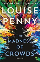
Oh, not if you’re a profitable author. I was reading Louise Penny’s The Madness of Crowds when I did my book cover research. It has an artsy, geometric design on the cover, and I remember thinking that I’d have no idea what the book was about, based on the cover. But it’s not the cover selling the book. It’s Louise Penny and Inspector Gamache.
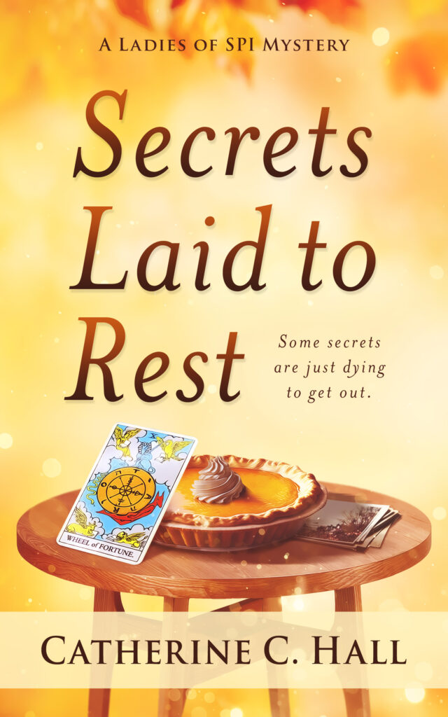
Catherine C. Hall might initially get readers from friends and family. But to attract readers who don’t know her from Adam’s house cat? That was going to start with the cover, a point made clear to me recently when I heard from my local library system.
My library system serves one of the largest and most populated metro Atlanta counties; Lord only knows how many books—hardbound, digital, and audio—are in the system. When it comes to those of us outside the trade publishers—regional or indie published authors—it’s not easy to get a book on the shelves. But it is possible. One fills out the form and waits.
So I filled out the form, dropped off a copy of Secrets Laid to Rest, and crossed my fingers. About a week later, I received an email, inviting me to give an Author Talk at one of our libraries. Not till March, but still, I was pretty darn excited!
Just this week, the staffer called. We touched on timing, how I had wanted to release the book last fall but the cover took way longer than I planned. And she said, “Oh! It’s a great cover. I noticed it immediately.”
She happened to be in the office of the staffer who gets the proposals and my book was on the desk. The cover caught her eye. I joked that it was worth it then, ‘cause that cover was a whole thing!
“We get a lot of books here,” she added. “But few of them look as professional as yours.”
Simply based on the cover, she had judged Secrets Laid to Rest to be professionally produced, a lesson to learn if you’re self-publishing. But I still think it’s important to look beyond the outside to what’s inside. So make sure the content of your book is as brilliant (and flashy!) as your cover!
Author, Secrets Laid to Rest
A Ladies of SPI Southern Cozy Mystery


8 comments:
Looking at your cover, I definitely would have pegged it as not indie. It is eye catching (and yummy). How do you go about getting a cover when you're self-published? Do you hire an illustrator?
Jodi, you can hire a cover designer in a number of ways...and the price is reflected in those options. I wrote a post about my trials and joys (and how to get a book cover designer)....I'll see if I can find and link to it. I used a company, ebooklaunch.com. SO glad you like it! It really was a whole thing!🤣
So here's the post I was thinking about, Jodi...a two-parter (the first part is linked in the post) and you'll see that it really was quite a thing. :-)
But eventually worth it.
https://muffin.wow-womenonwriting.com/2022/12/hating-confrontation-rest-of-story.html
I think a good cover is essential to catching the eye. I will at least pick it up and read the jacket or back copy. Yours is good. I recently received approval for the cover of my first novel, to be published by an Indie publisher and Lord...I hope it catches a few eyes!!
Thanks, Yvonne! And I hope your cover catches MORE than a few eyes!
The cover definitely matters if you don't know the author. I just got a book for review and it is . . . a really good book. But the cover? Meh. I look at it and think "what is this about?" The title has the same problem.
And? It was traditionally published. But it side-by-side with yours and I'd pick it as self-published.
Congrats on landing the author talk, Cath! How exciting. :)
You know how much I love your cover. I'm so glad you fought for what you wanted. You also brought up a very good point about the cover giving a clue to what's inside. I get that Louise Penny's designer wanted to give the feeling of crowds and madness, but in looking at her cover, I would've never guessed it was a novel! It looks like a nonfiction book about psychology, doesn't it? The cover should match the book, and it matters because it also sets up a promise to the reader. Have you ever picked up a book because the cover was beautiful, and then the book wasn't good or didn't match the vibe of the cover? That's the worst! You did a really good job with your cover. It's warm and inviting and filled with intriguing symbols and mystery. It fits your book perfectly. :)
Sue, you would think that, considering it's all about selling books, that publishers would be on top of that. Even trade publishers don't automatically get debut authors on the shelves now so...just saying.
And thanks, Ang! Penny's first books had better covers but now...they seem to lean to the abstract. Maybe it's trendy. But I do think titles and covers sell books for those of us on the other end of the market. :-) And though I published for me, I'm always happy to sell a book or two! ♥
Post a Comment