Back in May, I shared how I used an outline and beats and book-mapping in my latest manuscript. All of those methods were in the beginning to the middle to the end-of-writing/revising and though it may seem like a LOT, the writing process with this novel has been the smoothest yet.
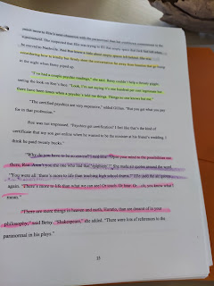
For the first 25 to 50 pages of the cozy mystery, I wanted to hone in on characters. This is an ensemble group and I wanted to see—through the use of color (gray, dark yellow, neon yellow, purple)—that there was a good balance. I also wanted to make sure I saw pink and green. Er, theme and setting.
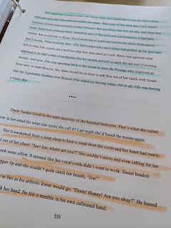 There are two distinct mystery arcs in this novel but since I’ve used a day-by-day titles for chapters, the arcs weave in and out. Each arc had its own color (the gel highlighters ran out!) but again, I wanted to “see” the story, in this case, for pacing and tension.
Read More »
BUT I promised you a last quirky tip that I opted to use this time once I was at the stick-a-fork-in-it, this-book-is-done stage. So here it is:
COLOR-CODING!
Oh my word, I love color-coding. Not just with manuscripts; I’ve used color-coding for all sorts of organizing! But I don’t have time to go down that rainbow rabbit hole. Today we’re here to see how color-coding your manuscript can be helpful and why you might want to try it for your next project.
First, the process.
I heard about this technique from author and publisher, Darcy Pattison. She recommended shrinking the manuscript and using different colors to highlight parts of the work-in-progress. That way, with the pages laid out in front of you, one can see with a quick glance the strengths and weaknesses (or whatever particulars one is looking to fix).
I didn’t shrink my manuscript; I spent about $25 to get it printed, mostly because I didn’t want to squint for hours. Next, I ordered amazing gel highlighters in about 20 different colors. These are typically referred to as “Bible Highlighters” as they work well in highlighting and allowing easy print readability (and they don’t bleed through). And then, I worked out what I needed to look for and the color key.

For the first 25 to 50 pages of the cozy mystery, I wanted to hone in on characters. This is an ensemble group and I wanted to see—through the use of color (gray, dark yellow, neon yellow, purple)—that there was a good balance. I also wanted to make sure I saw pink and green. Er, theme and setting.
I tried to be more intentional (though not too heavy-handed) with my theme (pink). I needed the theme to dip in and out, like a big toe in the pool. And setting (green) is a bit of an Achilles' heel with me. I prefer getting right to story and dialogue with the result that the richness of setting, which can also help with tone and story, gets left behind. So I had a simple goal there: I needed to make sure I saw green in each chapter, and a plush green in the set-up of the story.

As I highlighted the printed manuscript, I was not editing. (Okay, I circled three or four words that
weren’t working.) The colors, as Pattison had suggested all those years ago, helped me to “see” the novel in parts and in its entirety and I was very satisfied with the end result. You might want to use the color-coding at an earlier stage (first draft, for example) before doing massive edits (I used the book map for major editing). I’ll happily admit that I used color-coding at the very end because I kinda wanted to celebrate and see the novel in all its artsy glory.
weren’t working.) The colors, as Pattison had suggested all those years ago, helped me to “see” the novel in parts and in its entirety and I was very satisfied with the end result. You might want to use the color-coding at an earlier stage (first draft, for example) before doing massive edits (I used the book map for major editing). I’ll happily admit that I used color-coding at the very end because I kinda wanted to celebrate and see the novel in all its artsy glory.
That, and the fact that I wanted a bit of fun while I waited for my beta readers and editor to weigh in. There may be more writing work ahead for this cozy mystery but I’ll always have my color-coding.